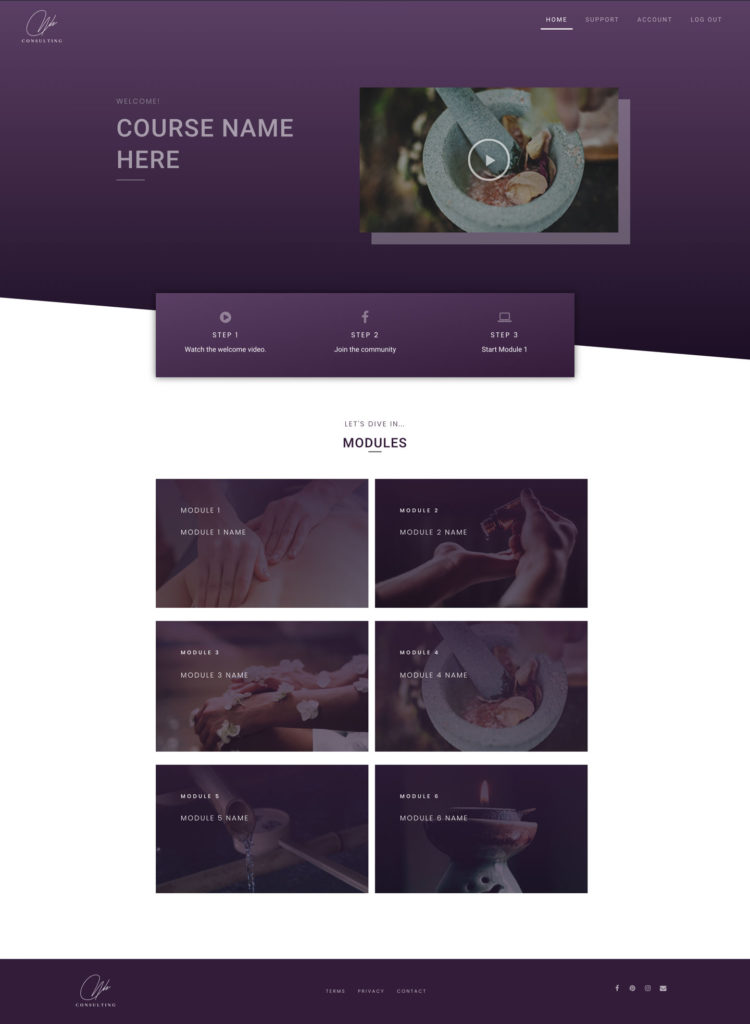
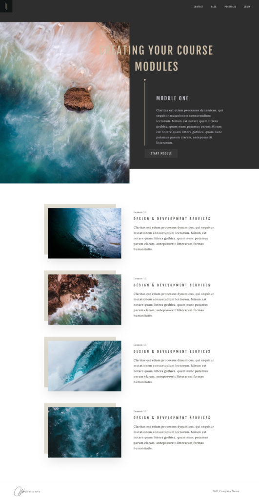
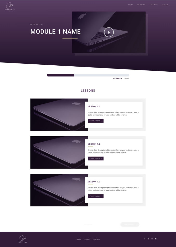
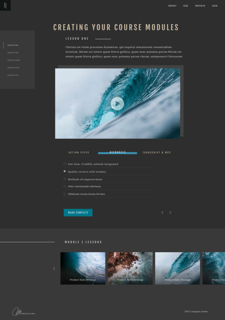
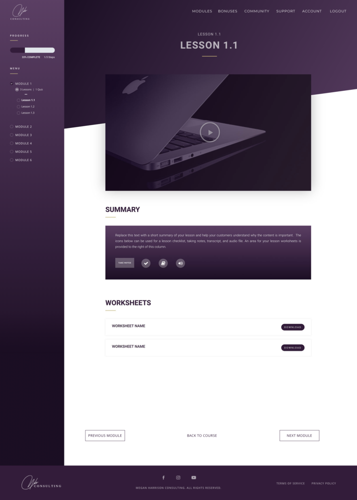
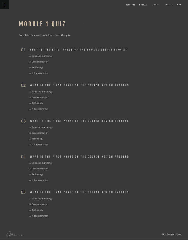
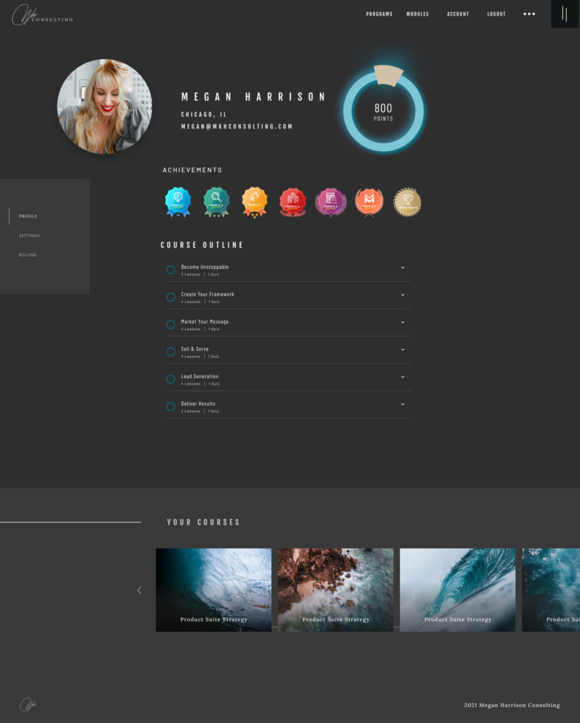
Let’s nerd out on a little tech stuff for your online course. When it comes to creating your membership site for your online course I can see how it could get overwhelming trying to think through all the pages that need to be designed and developed.
The cool part about this is that regardless of what industry, market, or course topic the core pages are always the same for all of my clients/customers.
Of course, there’s a lot of additional functionality that can be built into the membership site such as gamification, social forums, event/calendar system, etc … but today I want to focus on the core pages…
This is a time where a list can come to the rescue…
- Login Page
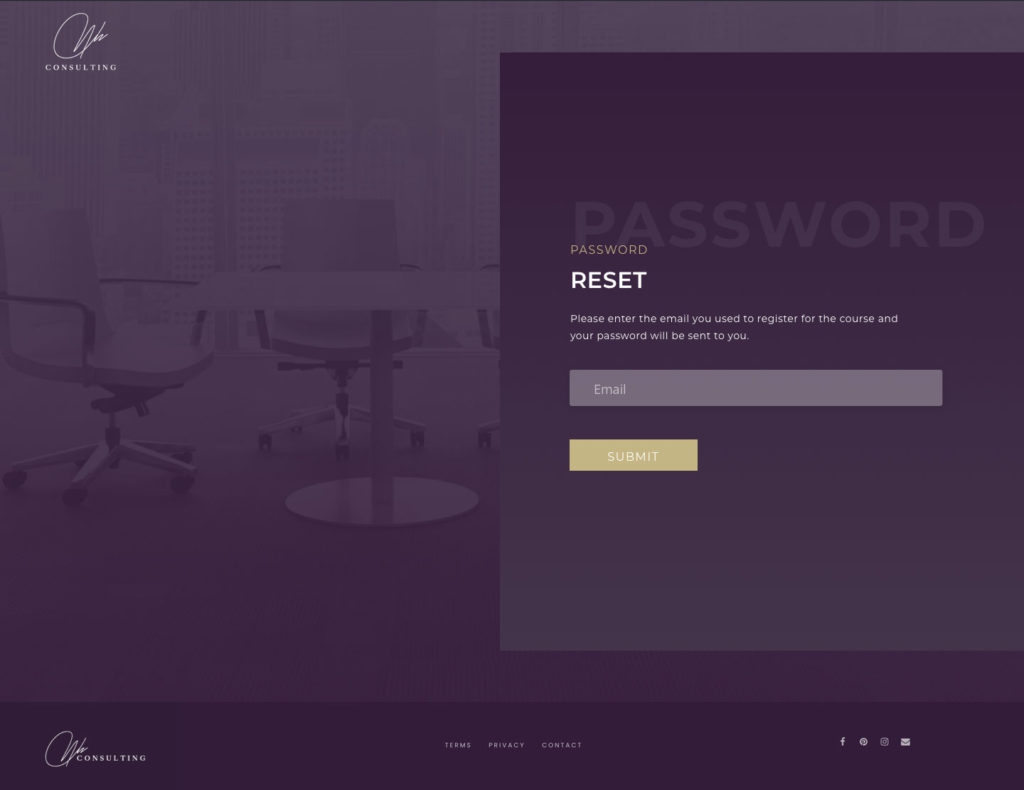
- Password Reset
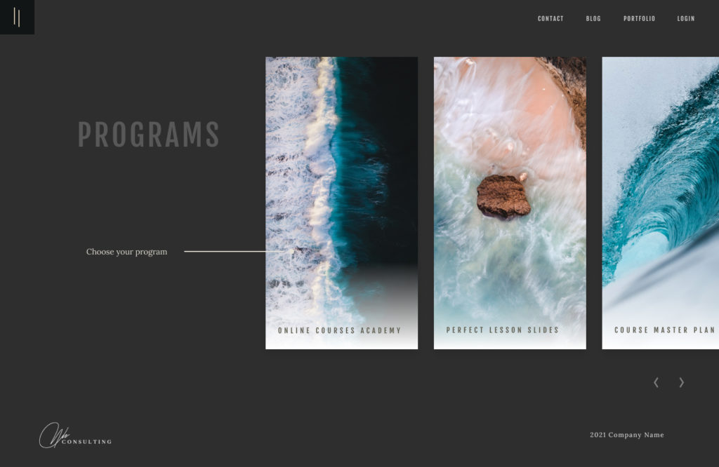
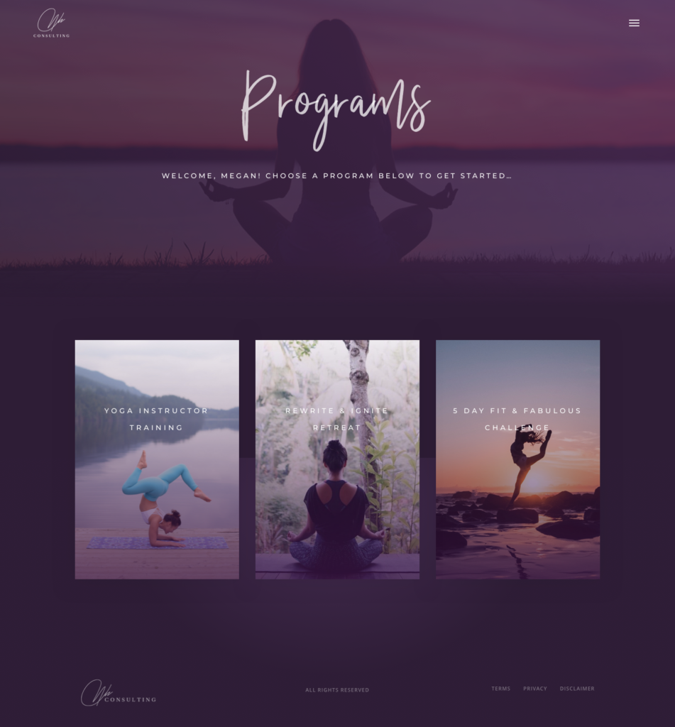
- Programs Page
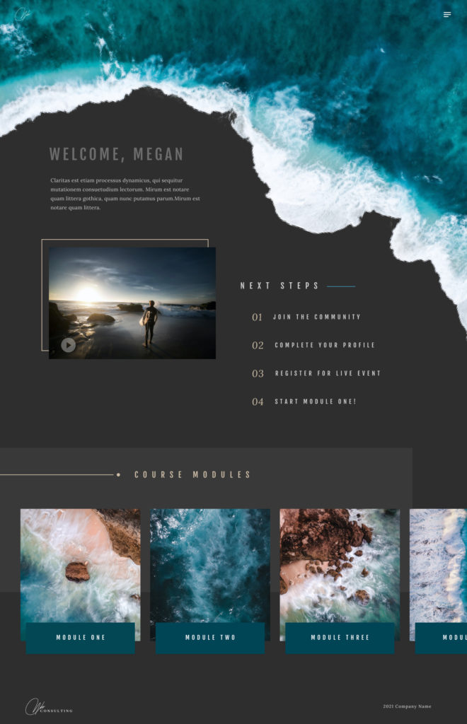
- Course Homepage
- Module Template
- Lesson Template
- Quiz/Assignment Templates
- Account/Profile
- Notes
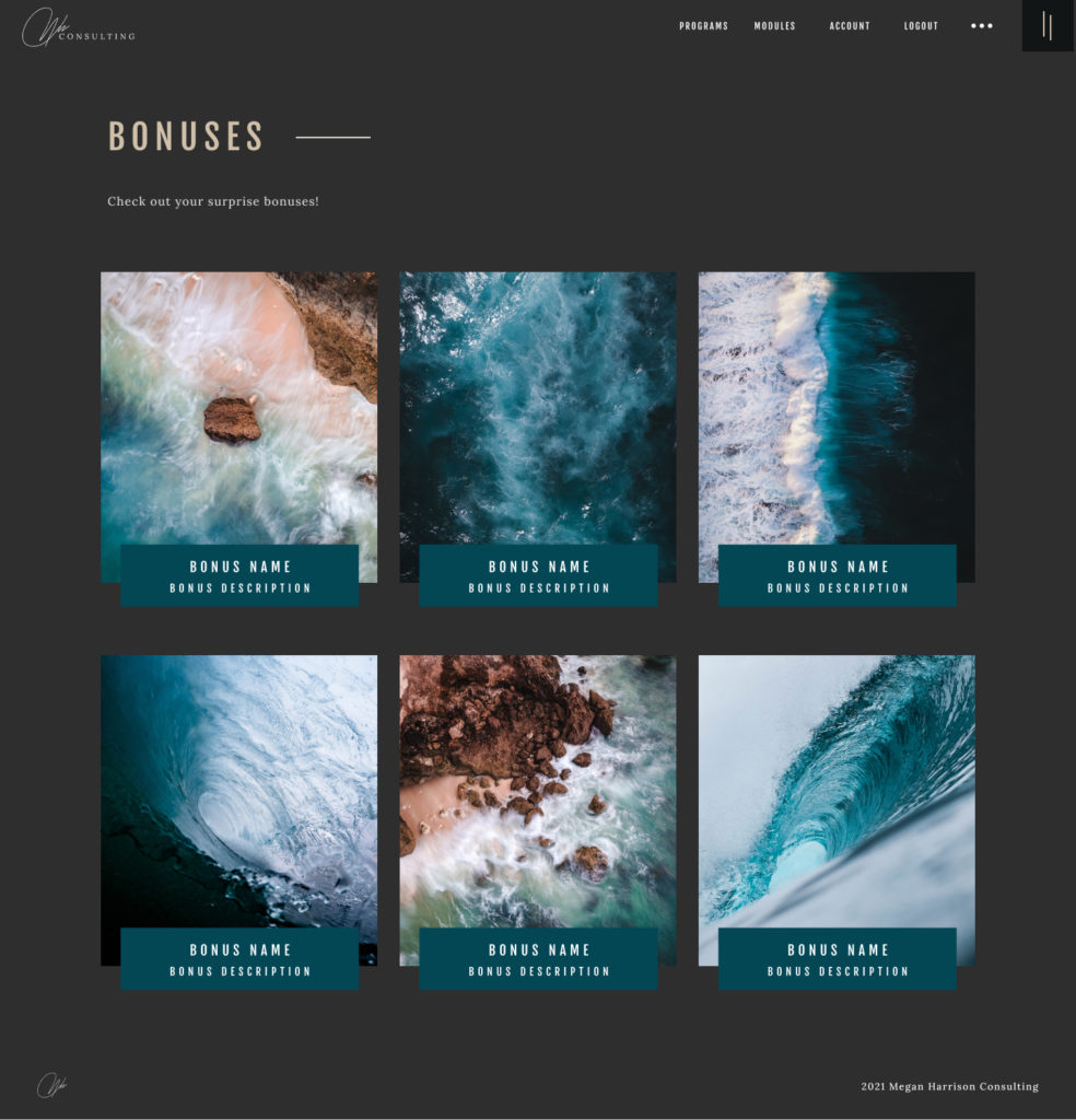
- Resources and/or Bonuses
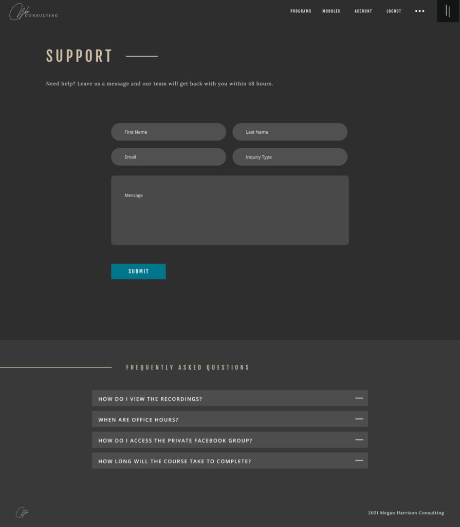
- Support/Contact
- Suspended Access
- Access Not Yet Released
- Privacy/Terms
9. Support/Contact Us
Include an FAQ section, contact information, and form for customers to submit questions, comments, and/or concerns. I prefer to use a live chat system such as Intercom. Not only does this allow you to communicate with your customers but you can also include support documents, chatbots to help customers find answers themselves, and a ton of other really cool features.
11. Notes
This page isn’t 100% mandatory but I include it within all of our courses and client’s courses because it provides a great user experience and I’ve heard over and over again from users how much they love being able to have all their notes in one place.
This type of functionality requires more advanced development. The next best option would be to include a list of all the resources without the filter and search capability.
12. Suspended Access
If you are providing a payment plan option or your course is set up as a monthly subscription, it’s important to have a system in place that automatically removes access if a payment fails and automatically restores access once the payment is received. This is the page that users will be redirected to if they have an unpaid invoice and provides them the ability to update their credit card information or submit payment.
13. Access Not yet Released
This page is only needed if your course content is released over a period of time rather than all at once. This page will let customers know the content is not yet available and provide instructions to either return to the previous module, engage within the community, implement something that was already taught, or anything else that would be of value.
If you include these pages within your membership site your course will be set up for success and provide a user experience that is 10x better than 95% of courses being sold.
Learn more about our done-for-you online course design and development services you can find more information here or view our portfolio to see some of our recent projects.
Our core online course development package starts at $10,000 and includes each of the pages listed in this post.
If you’d like to implement this yourself and get access to our online course page templates that you can upload in just a few clicks, check out Online Courses Academy. Not only does it provide you a complete system for planning, creating, and launching your online course… but you also get access to over $800 in software, plugins, and themes!


