Transcript
I am really excited to share this because it’s been a super fun project. As usual, this is the third big course that we’ve created together, and we’ve probably done about five or six other ones. The difference between this course and the Knowledge Business Blueprint and Knowledge Broker Blueprint is that this one is more focused on online courses, which I love—obviously, it’s my specialty. The others are more focused on in-person live workshops and masterminds.
With everything that’s happened within the last year, the entire world has had to shift very quickly into online courses. Even people who weren’t previously taking or building courses really didn’t have any other choice—it was a sink-or-swim type of situation. One of the questions that I think is really good is whether online courses are oversaturated now because so many people are creating them. On one hand, yes, there are a lot more people entering the market and creating courses because they were forced into it and then realized it’s not that bad. Tony Robbins, for instance, never planned on doing UPW (Unleash the Power Within) or his live events online because he didn’t think the results could be achieved online. But now, after being forced into it, they’ve seen the amazing ways they can reach so many more people online.
I don’t think online courses will ever fully replace live events—I love live events and can’t wait to start going to them again. But online courses definitely work. There’s a reason this is almost a billion-dollar-a-day industry, or will be within the next few years. While there are more people entering the market and more courses being created, the buyer’s market has also drastically expanded. People who never thought about taking things online were forced to try it and found it beneficial.
Now, I’m going to share my screen to show you a little bit of the design process, as well as the site itself. The first step, after figuring out the outline, is understanding the goals and objectives of creating the course and then leveraging design to achieve those. For me, design is not just about aesthetics—it’s about using design as a tool to achieve outcomes, such as getting customers to consume the content. This is crucial because it’s the only way they’ll have a chance of implementing and reaching desired results. If they achieve those results, they’re happier, your course and business reputation improve, demand increases, and so does customer lifetime value. People who achieve results from your first product are more likely to purchase other courses or services you offer.
When it comes to design, especially with so many more courses on the market, aesthetics and user experience are more important than ever. I hold design in high regard because it gives a higher perceived value and sets you apart as a premium brand.
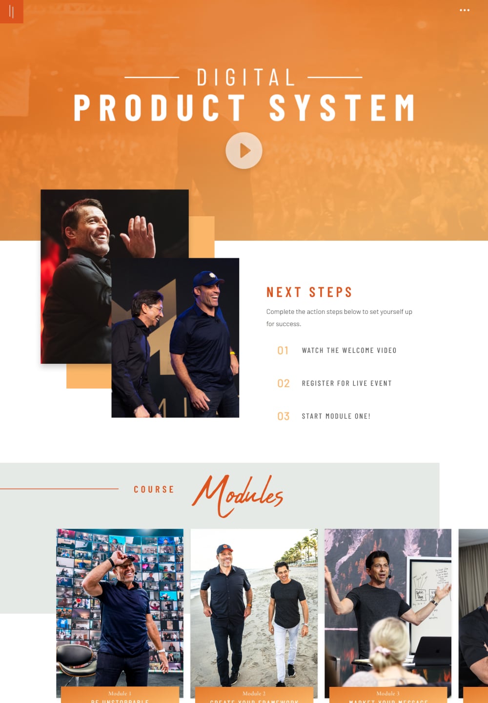
Let me show you the course from my desktop first. This is what I consider the course home page—think of it as the table of contents for your program. It welcomes customers to the program, typically includes a welcome video, next steps, important resources, software links, and a community link. Below that are the modules, like sections of a book, with lessons within each module acting as chapters. We have modules one through six listed here in a slider to display content cleanly without feeling overwhelming.
The next point is reducing overwhelm and keeping people clear on what they need to do next. People are willing to pay premium prices for online courses because they’re looking for the fastest way to get from A to Z with less headache and stress. By purchasing a course like this from Tony and Dean, who have mastered this area with a combined 65 years of experience, they can avoid obstacles and pitfalls they might face on their own.
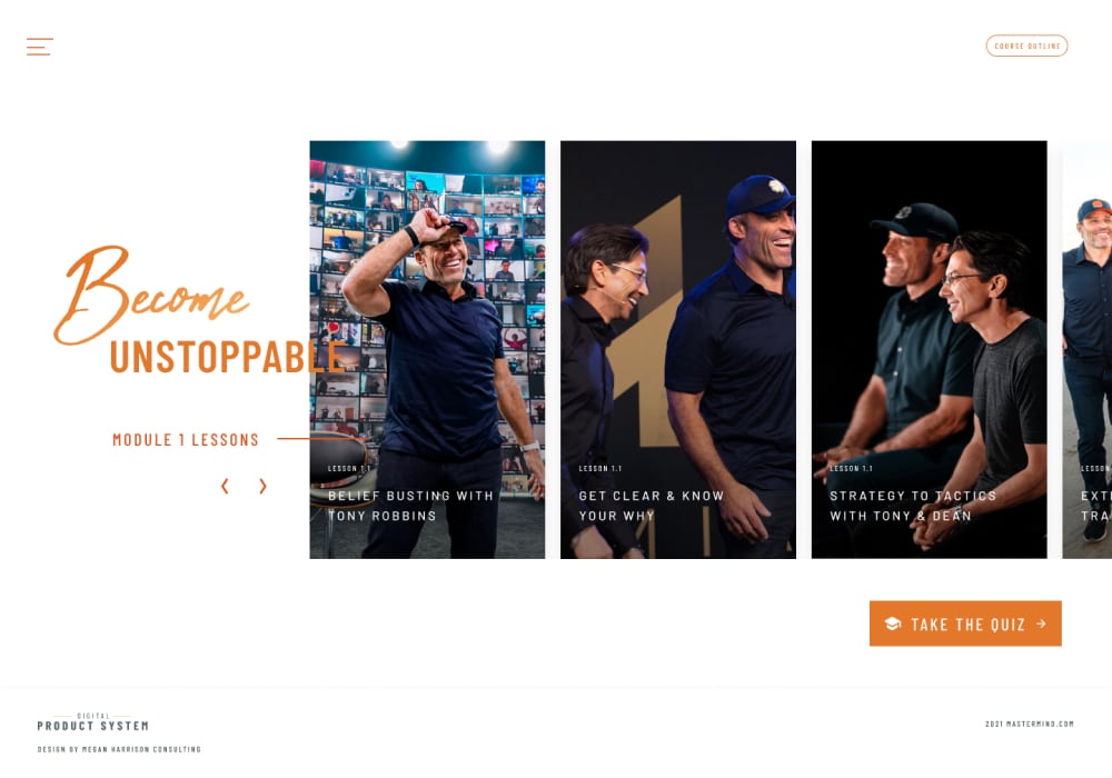
Now, let’s look at a module page. This is a simpler design to keep people focused on consuming the content. We need to ensure easy navigation and clear progress tracking to minimize confusion and frustration. On the module page, you see all the lessons listed with navigation options. Keeping the design consistent helps users know what to expect and stay on track.
For example, here we have module one, lesson one, with a quiz that unlocks a bonus and additional advanced training for those at different stages of their journey. Users always know where they are and what’s next, with clear navigation and resources for each lesson.
One improvement I’m planning is making the locked and unlocked icons more distinct. Navigation and progress tracking are critical for keeping users on track and minimizing frustration. We use a custom-built navigation using advanced custom fields to ensure users can access the content they need without clutter or confusion.
The mobile experience is equally important. I aim for an app-like feel to provide a great experience on both phone and desktop. While I haven’t switched to an actual app due to cost and complexity, the mobile version mirrors the desktop structure with slight adjustments for smaller screens.
Sliders and intuitive navigation make the mobile experience seamless. Lessons and modules are organized clearly, with easy access to quizzes and resources. I constantly look for ways to improve, ensuring users have the best experience possible.
Finally, let me show you the resource library, which I absolutely love. It’s a filterable and searchable library of all content, making it easy for users to find what they need quickly. The library includes lessons, worksheets, bonuses, and more, with membership protection ensuring users only see resources they have access to.
In summary, the design process focuses on achieving course objectives, enhancing user experience, and ensuring clear navigation and progress tracking. By leveraging design effectively, we can create an engaging and valuable online course experience for users.
I’m also an affiliate for the program, so if you’re interested in purchasing the course, I’ll include my link in the comments below. If you purchase through my link, you’ll get access to the Online Course Makeover Workshop in two weeks. It’s a live virtual workshop where I’ll walk you through creating your style guide for your online course and provide templates for your style guide, worksheets, social media, and lesson slides.
The biggest benefit of having a style guide is that it makes implementation much faster and ensures consistency, setting your course apart as professional and well-designed.
Thank you for joining me on this journey. I hope you have a great rest of your day!
I’m thrilled to take you behind the scenes of the design and development of Tony Robbins and Dean Graziosi’s latest course, Digital Product System!
This project has been incredibly enjoyable, and the course design is my favorite to date. In the video, I share my thought process behind designing the course pages to optimize the user experience.
You’ll also see how we integrated gamification throughout the program to boost content engagement.
We built Digital Product System on WordPress using LearnDash LMS and Memberium Membership plugins.
Additionally, you can watch an in-depth review of our previous course, Knowledge Broker Blueprint, here.
Get ready as I guide you through the journey of creating this outstanding online course!